Designing business travel initiatives across mobile and web
Bundled travel initiatives that show how I design enterprise workflows end to end
This case study summarizes the main business travel initiatives I designed on the ByteDance Travel team. They were delivered at different times under the same constraints: policy compliance, approval efficiency, and travel decision making.
I've grouped them to show how I design end-to-end enterprise workflows across mobile and web, for both travelers (applicants) and approvers.
Three recurring patterns shaped every initiative on the travel team
Flexibility and compliance pull in opposite directions
Trips change often, but policy and approval rules have to stay enforceable.
Travelers and approvers operate on different mental models
Travelers optimize for speed and control. Approvers optimize for clarity and risk reduction. Every screen has to satisfy both.
Hotel booking carries high decision effort that needs spatial context
Hotel choice needs location context, but a default map UI can be noisy and inconsistent inside an internal product.
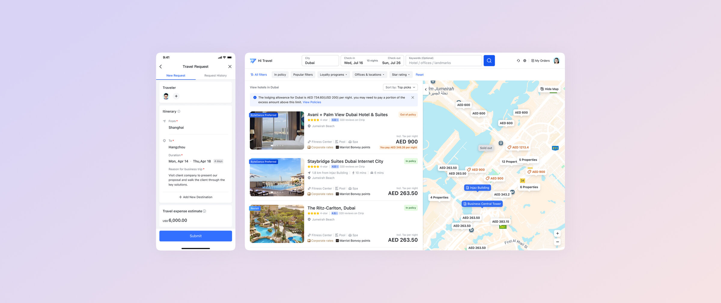
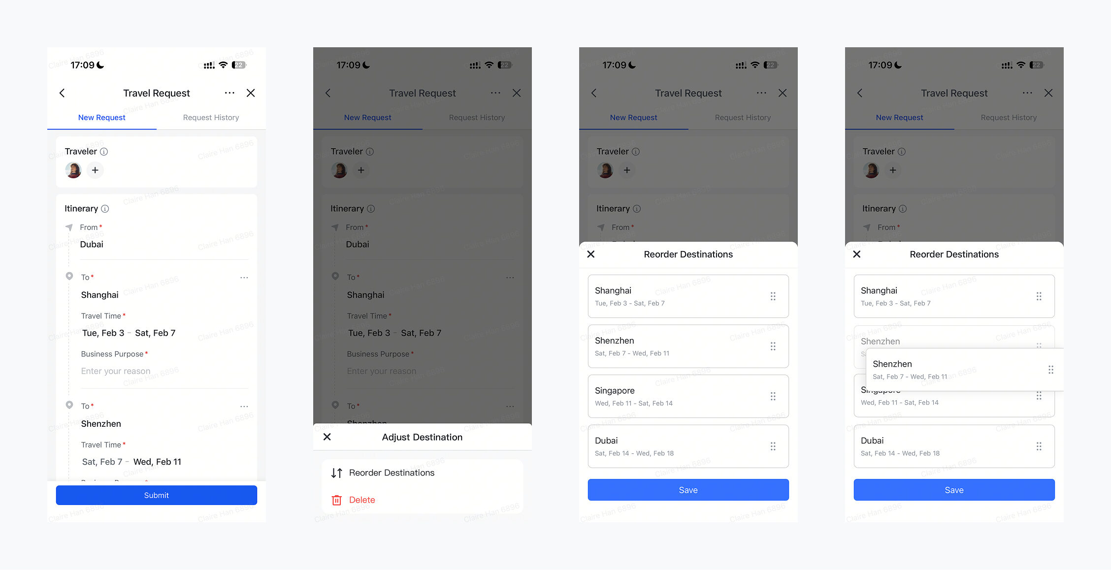
Mobile Trip Request: structured itinerary planning with low editing friction
Travelers now specify a daily schedule per city, so approvers can judge necessity
Old request flow asked only for a date range and a generic reason. Approvers had no view into what travelers actually planned to do, and unnecessary trips slipped through.
The new flow requires time and a work plan per city, so approvers can judge whether the trip is necessary and reduce unneeded spend.
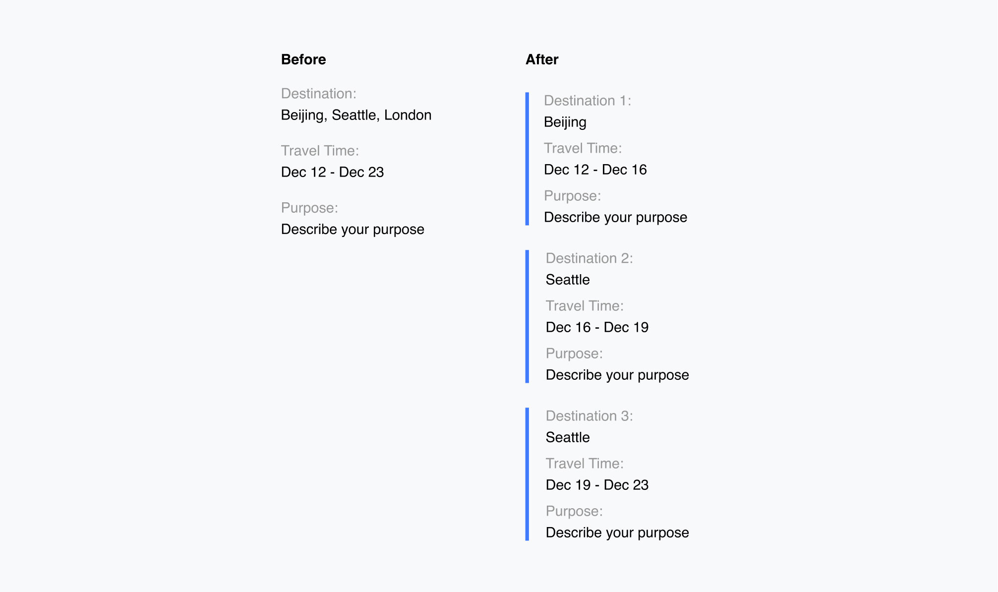
Drag-and-drop itinerary cards kept the added input fast and non-blocking
The added input was unavoidable, so I focused on making edits fast. Drag-and-drop itinerary cards let travelers reorder trip segments without re-entering details.
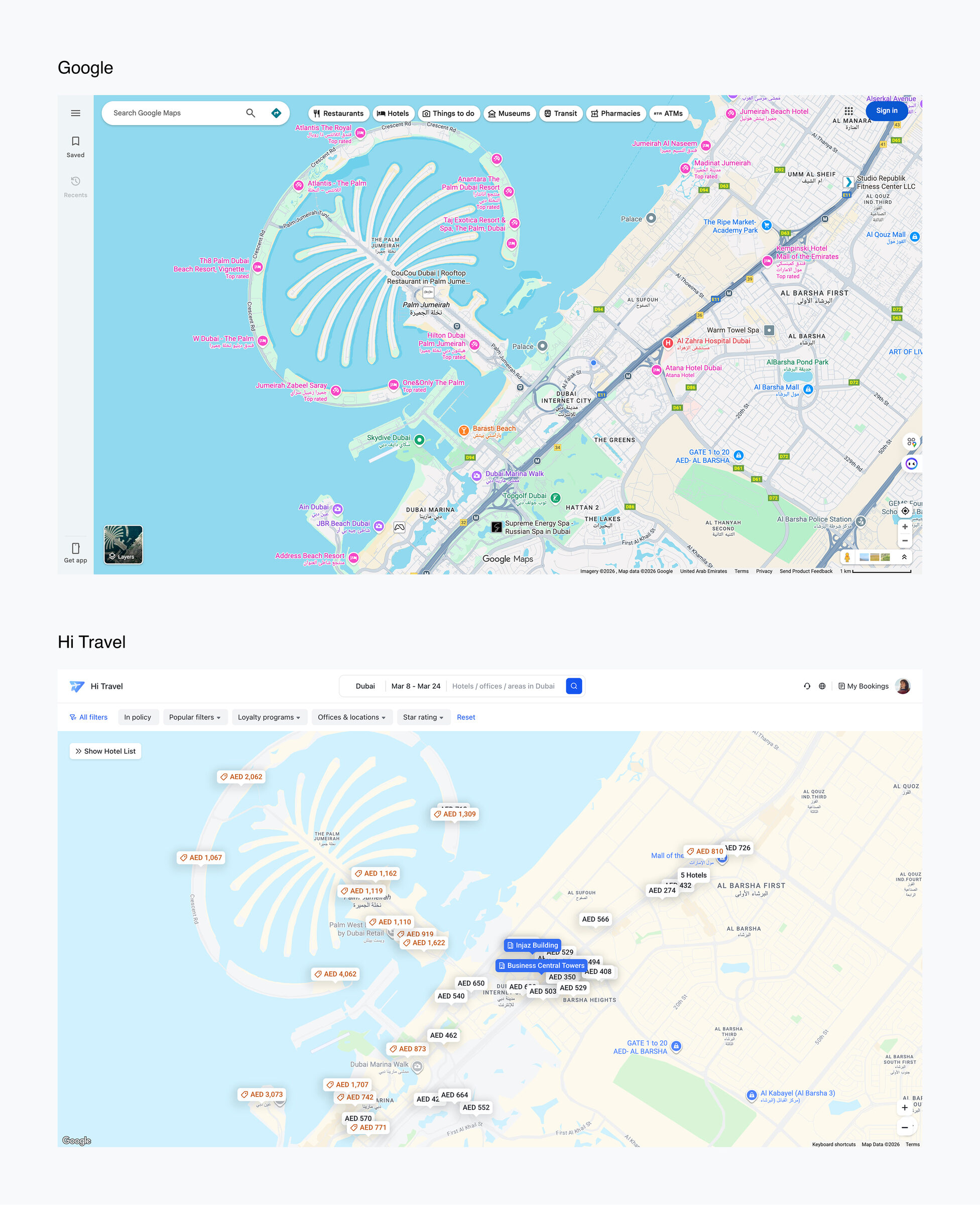
Web Hotel Booking: map-based decision support near the company location
A map plus list experience supports comparison and confidence, not just a map view
The goal was helping employees choose hotels faster by adding spatial context to the booking flow. I designed the map and list to work as one surface: distance, price, and availability are comparable in the same glance, instead of forcing the user to toggle between two views.
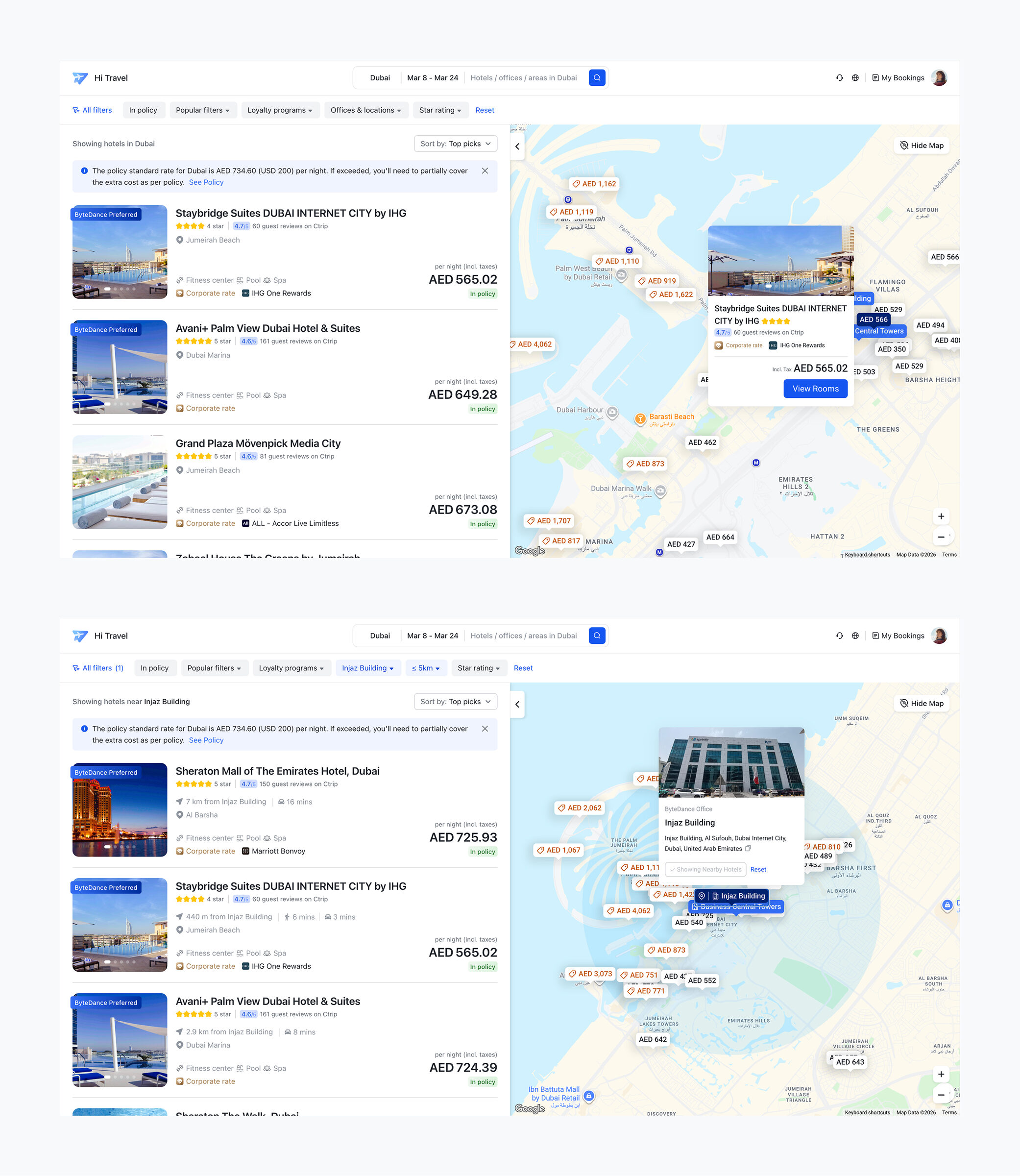
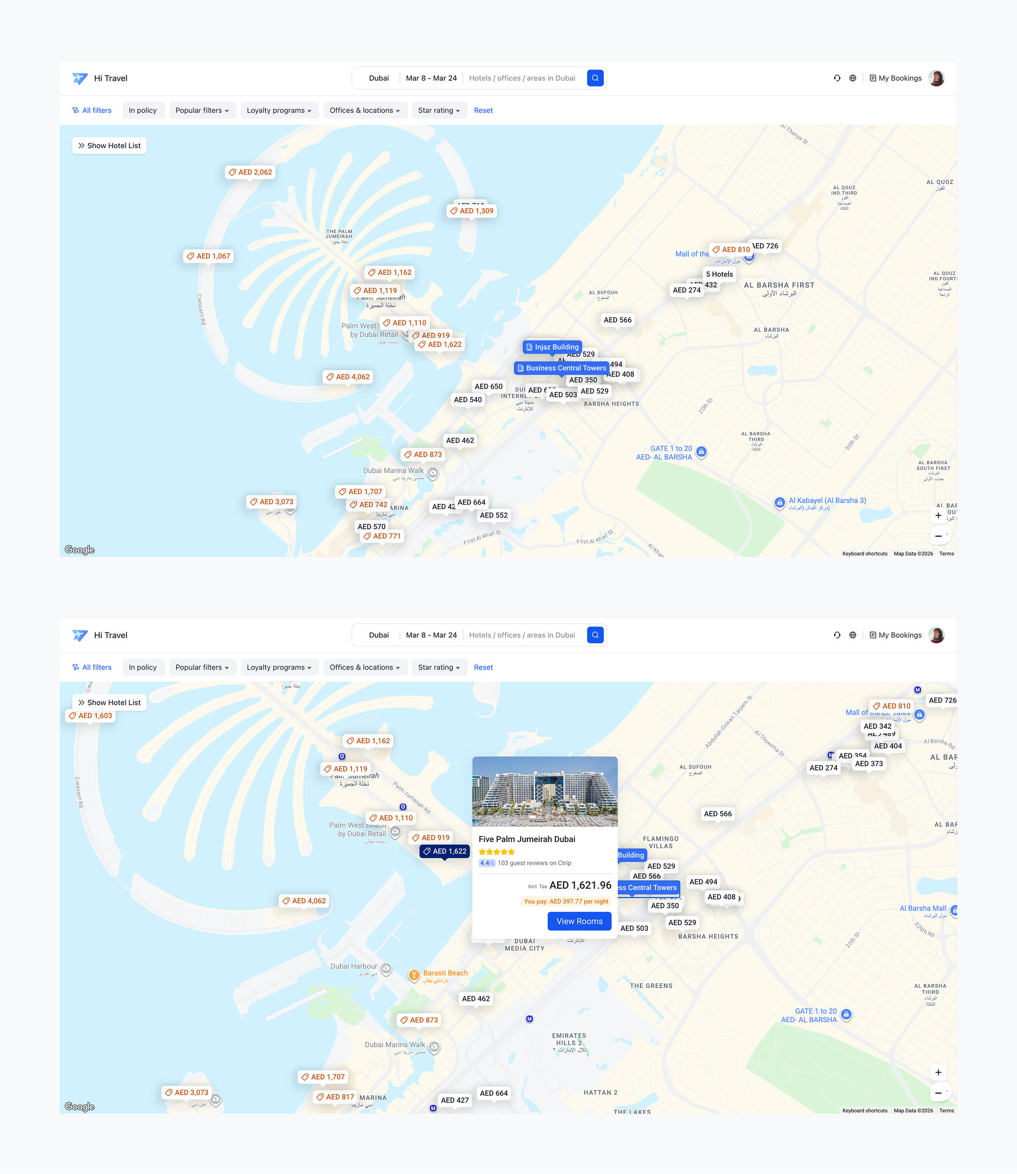
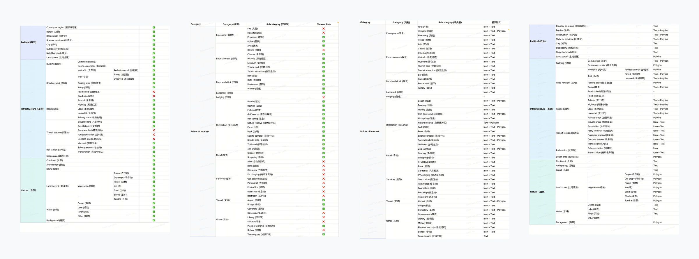
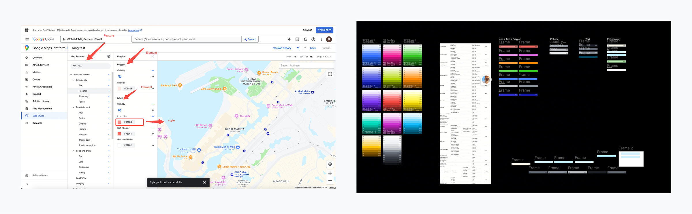
Custom map styling made Google Maps feel first-party
Default Google Maps felt visually external and too dense. I validated feasibility and applied custom map styling as part of the product UI system.
Decomposed map elements into points, lines, and areas. Decided what to keep and what to remove for the “near company site” scenario. Then mapped the remaining elements to the internal color palette for consistency and scanability.