Redesigning the Task Center to simplify complex status tracking
The Task Center couldn't keep up with CloudTower's growing complexity
I led the end-to-end redesign of CloudTower's Task Center (Web), and built a standardized component library by componentizing task cards as Figma variants, giving future iterations a single source of truth.
Most data center operations are asynchronous, so users need a place to track them
In data center management, most operations are asynchronous. They don't finish immediately. Users initiate a task and switch to other work while waiting for the result.
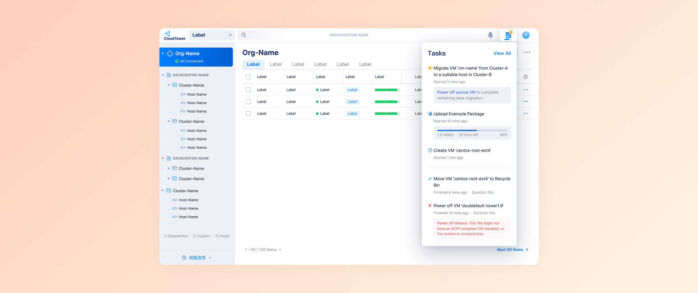
The Task Center acts as a unified hub, letting users track the status and outcome of all background operations in one place.
As CloudTower added more complex features, the legacy Task Center hit its limits
As CloudTower introduced more complex features, the legacy Task Center design could no longer handle the increasing data density and complexity. We needed a scalable solution capable of displaying intricate task details and supporting the platform's future growth.
Mapping task states and user behavior before any UI work
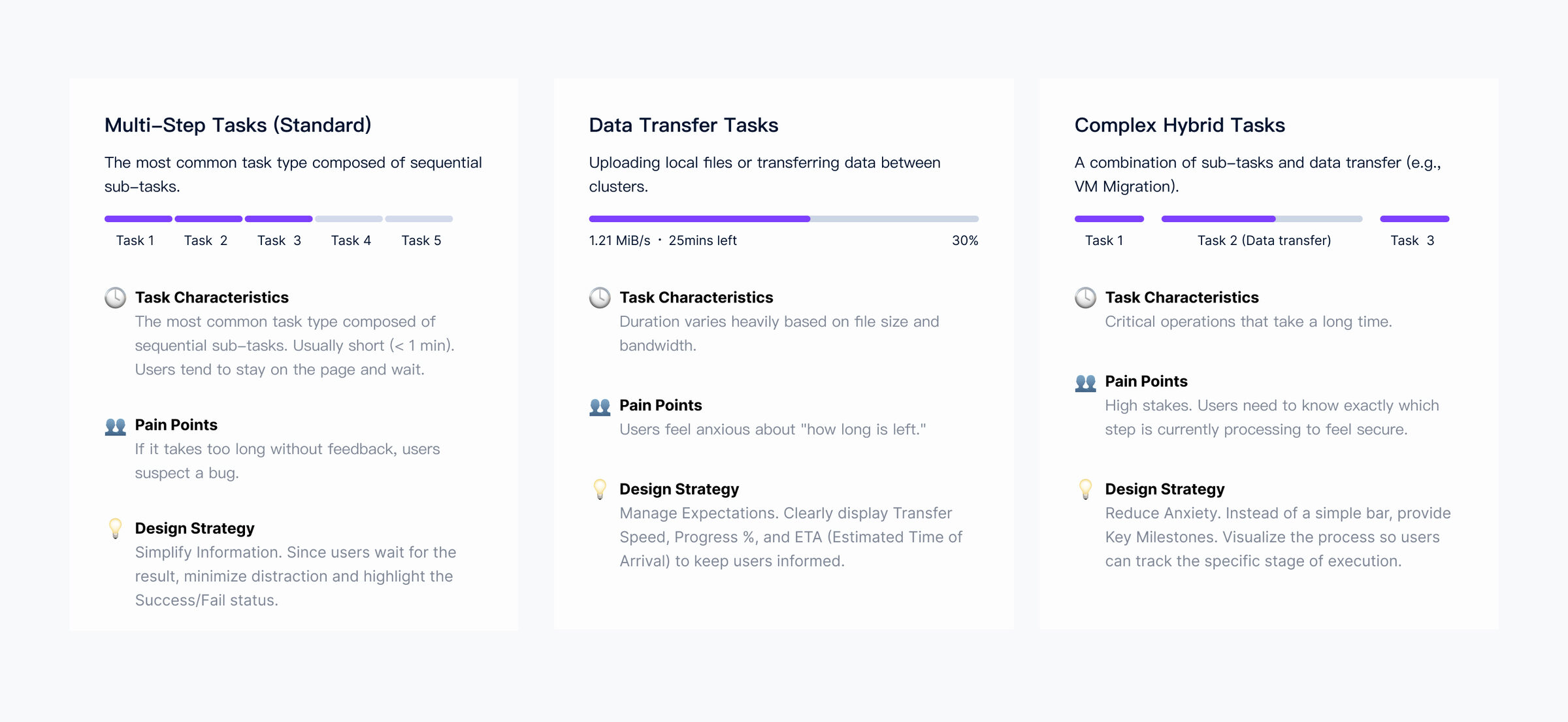
I started by understanding task types, user behaviors, and real needs
Through user interviews, competitive analysis, and UI walkthroughs, I identified the current task types, user behaviors, and needs.
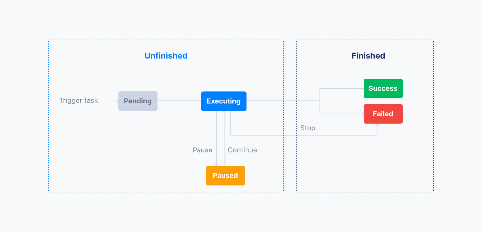
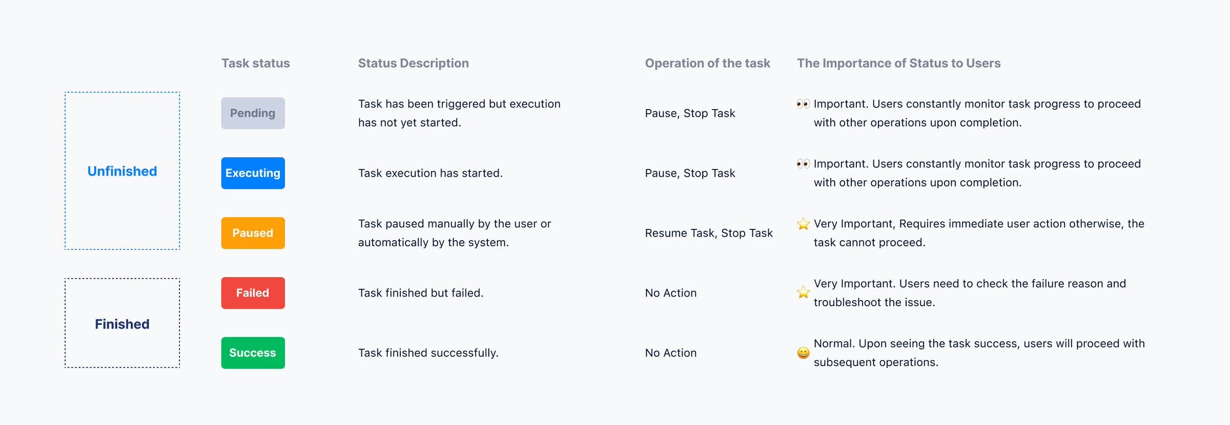
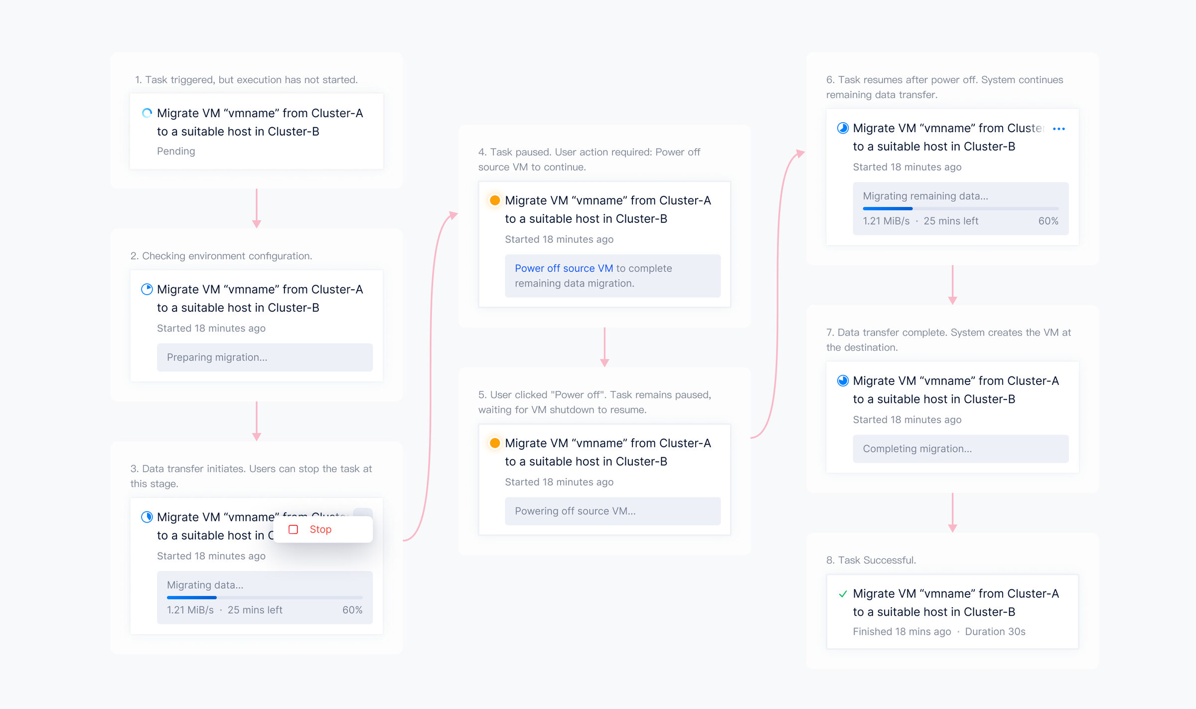
Then I mapped out the task state machine end to end
A task transitions through various states from initiation by the user to completion. Different task states influence the actions a user can perform and vary in importance to the user.
Five focused improvements that compound into a clearer Task Center
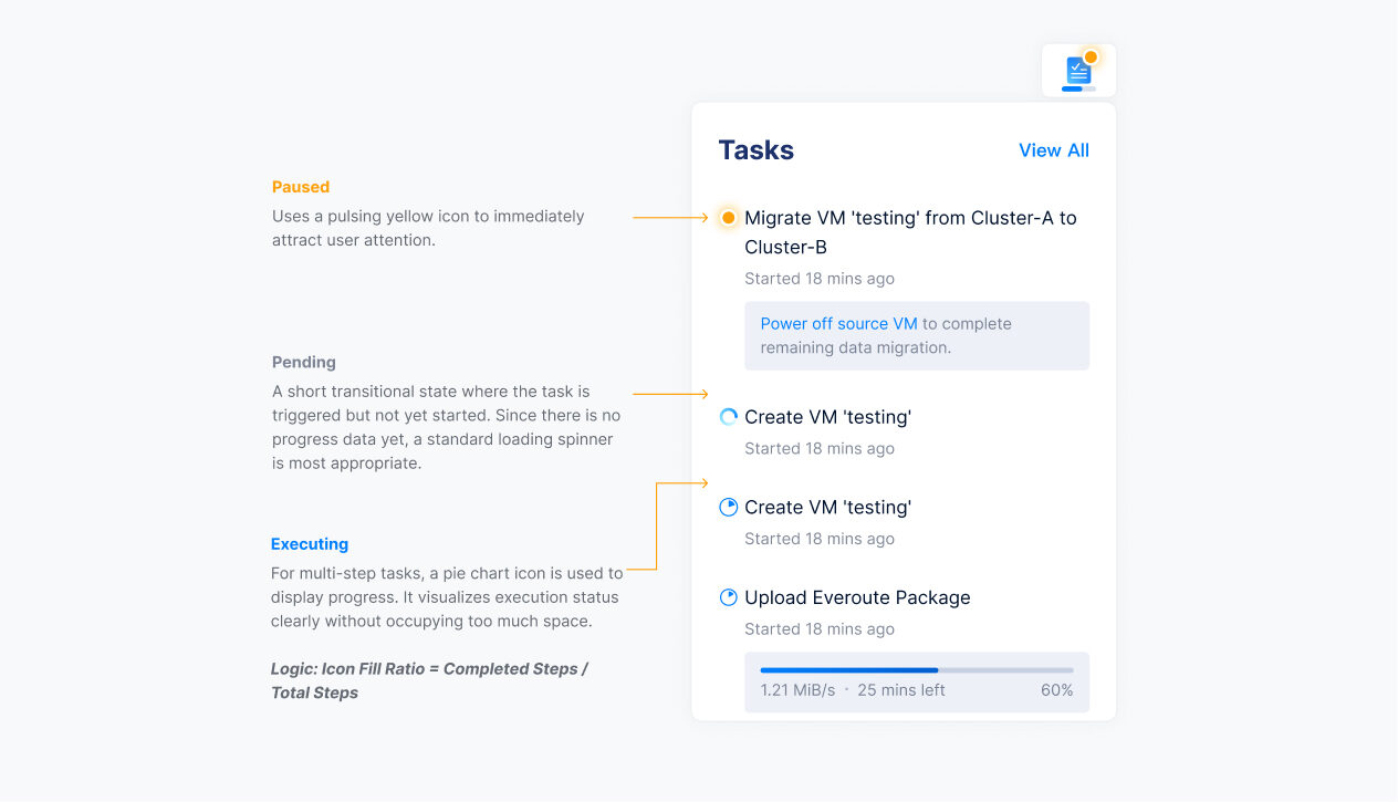
Part 1: Distinct icons replaced the generic spinner so progress is legible
Before. Whether it was a step-based task or a data transfer task, the same generic “In Progress” icon was used. For most non-data-transfer tasks, users had no visibility into the specific step. Just a spinning loop.

After. I designed distinct icons for each of the three states to help users visualize progress and prompt the actions they need to take.
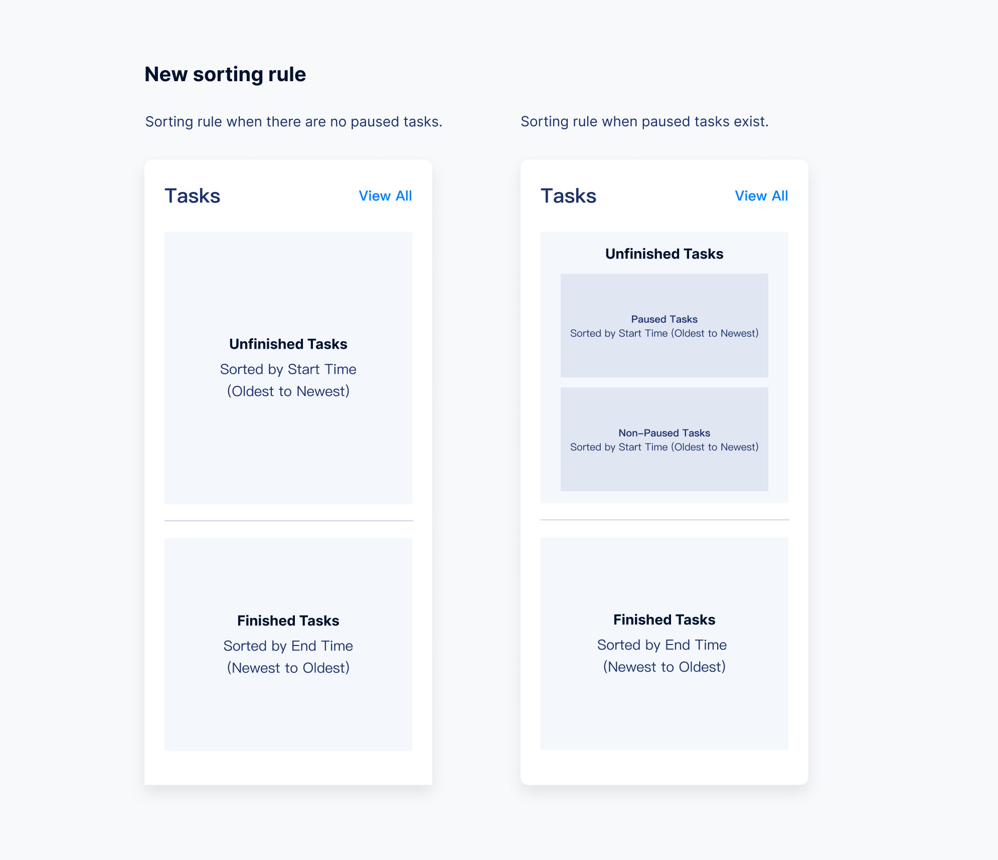
Part 2: Status-based sorting kept paused tasks visible
Before. Sorting strictly by “Start Time” pushed critical “Paused” tasks (the ones that need user action) out of the viewport. Users had to scroll extensively to locate them.
After. Sorting is no longer strictly chronological. I implemented status-based sorting: tasks requiring user attention are prioritized at the top, so critical items aren't pushed out of the viewport by new incoming tasks.
Part 3: Persistent task history removed the unstable disappearance
Before. Completed tasks vanished immediately after the panel was closed (marked as “Read”). If a user closed the panel by mistake, they had to navigate to the full “All Tasks” page to find the task again.
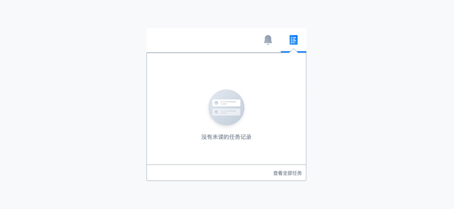
After. I removed the volatile Read/Unread states. Recently completed tasks are persistently displayed in the panel, giving users a stable reference.
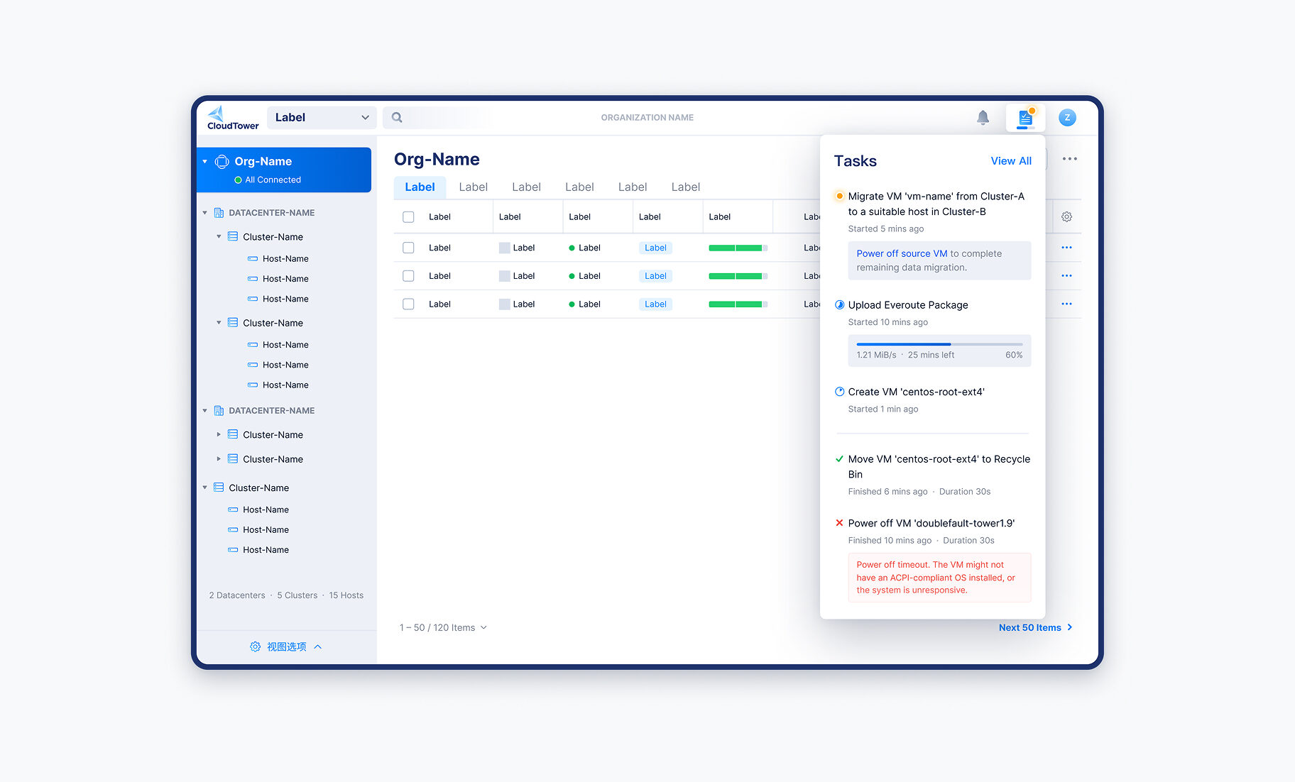
Part 4: A dynamic panel height showed more tasks at once
Before. The panel's fixed maximum height severely limited how many tasks were visible. During high-volume operations, users scrolled repeatedly within a small window to track their tasks.
After. I removed the fixed height. The panel now maintains a fixed 64px gap from the bottom of the screen, maximizing the available space to show more tasks.
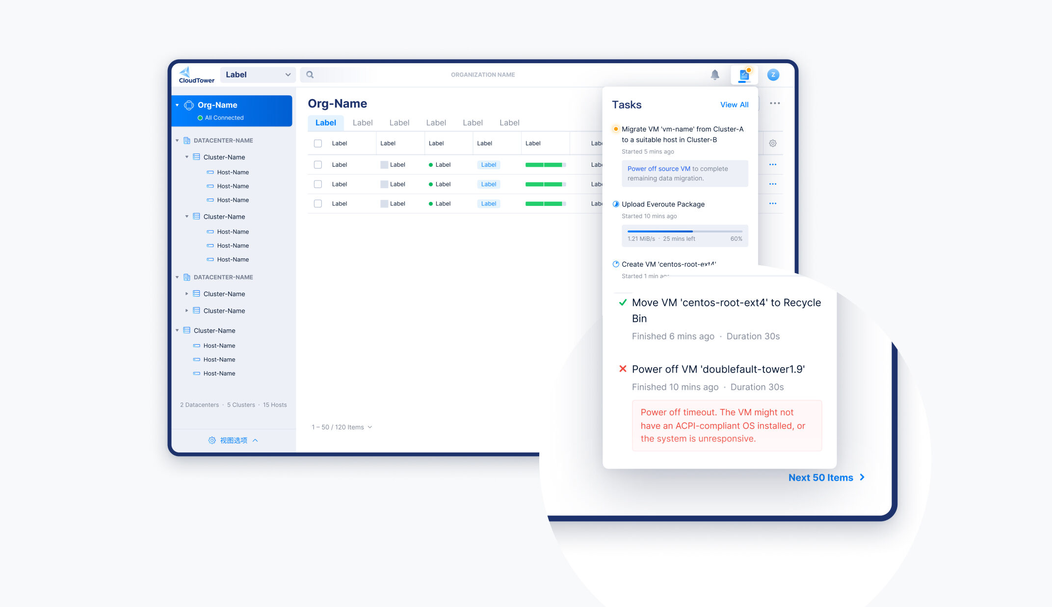
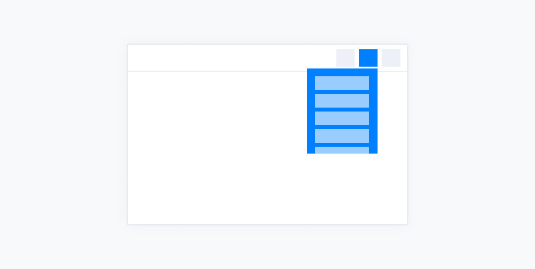
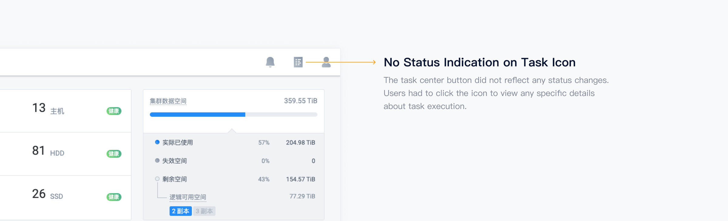
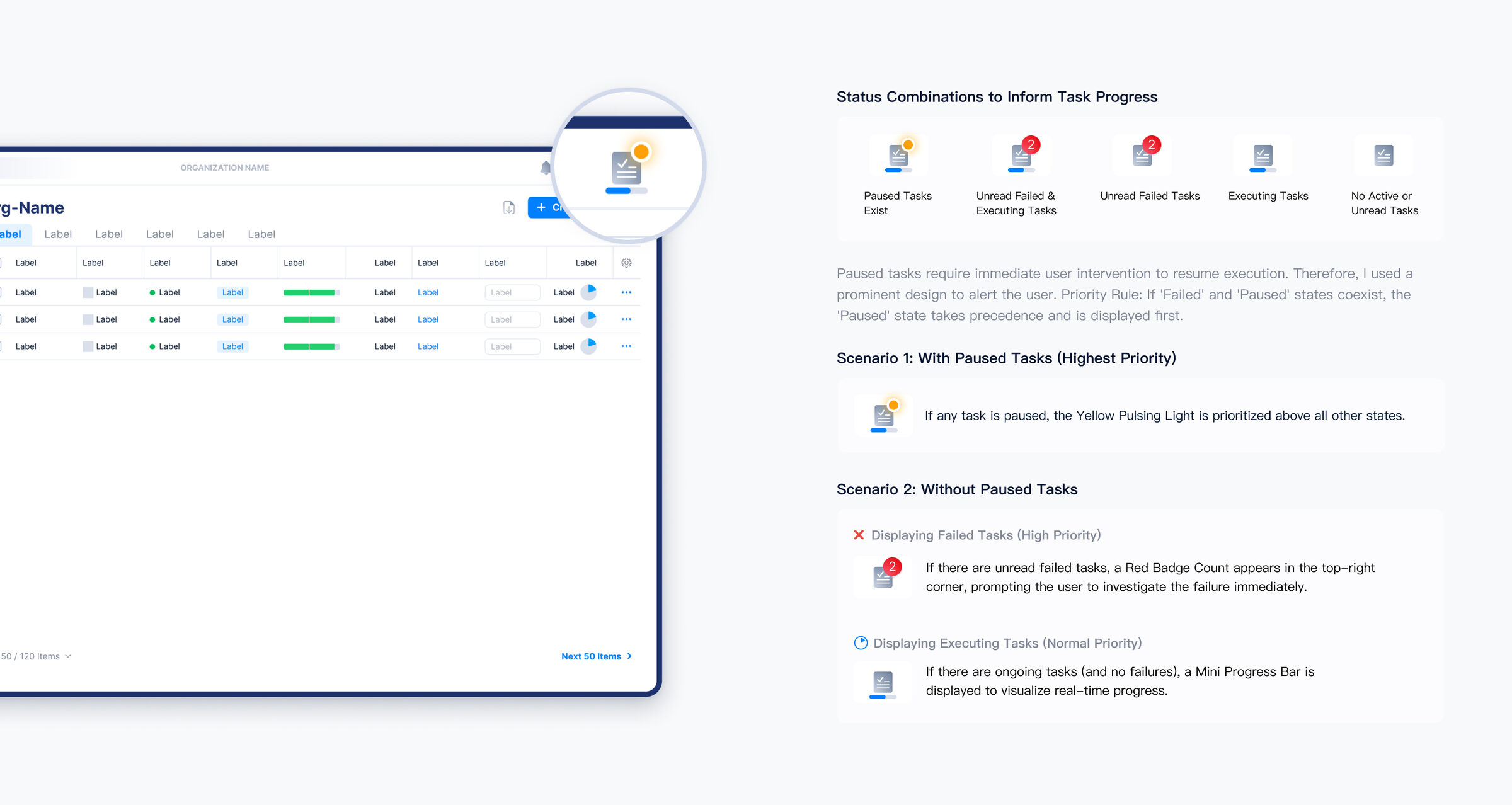
Part 5: A dynamic icon surfaced task progress without opening the panel
Before. The Task Center button didn't reflect any status changes. Users had to click the icon to see any details about task execution.
After. Status combinations on the icon now inform task progress at a glance, surfacing changes without the user having to open the panel.
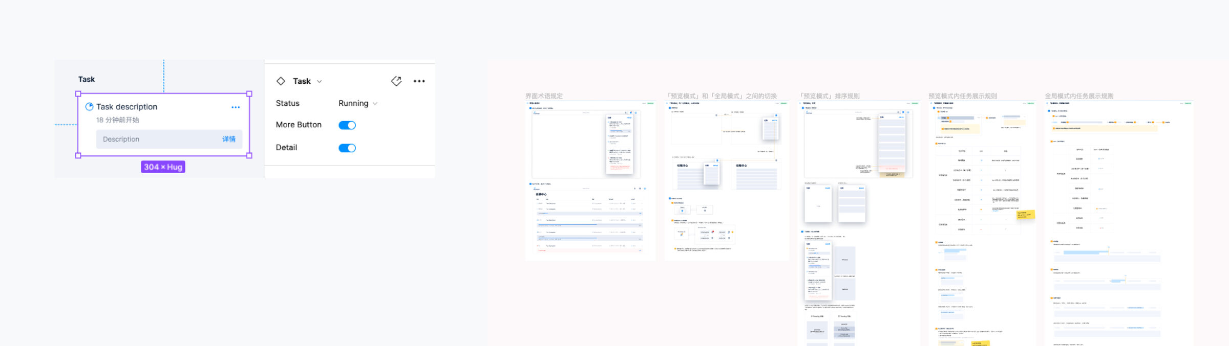
Componentized task cards became a single source of truth across teams
By encapsulating the task cards into Figma Components with Variants, I created a single source of truth for all task states. This reduced design redundancy and improved the consistency and efficiency of future design iterations.