Redesigning the supplier portal so sourcing stops falling back to email
Sourcing was quietly leaking out of the supplier portal
The Supplier Portal is ByteDance's internal product for suppliers to complete the full procurement process with buyers. That process spans sourcing, contracting, acceptance, and settlement.
In sourcing, the flow kept falling back to email
Suppliers barely used the system for sourcing, which created three concrete problems.
No audit trail. Quoting and negotiation records lived in email, leaving compliance audits with no system of record.
No data to build on. Without system records, there was no foundation for a price library or historical benchmarking.
Manual overhead for buyers. Batch-sending emails and tracking suppliers manually was pure human cost.
The project's core goal was to increase online adoption of the sourcing flow
Research that overturned my Task Center hypothesis and reframed where to start
Sourcing was the loudest complaint across the entire procurement system
A broader study of the full procurement platform surfaced sourcing as the area with the most complaints. But “bad experience” is a symptom, not a designable problem, so I went a layer deeper.
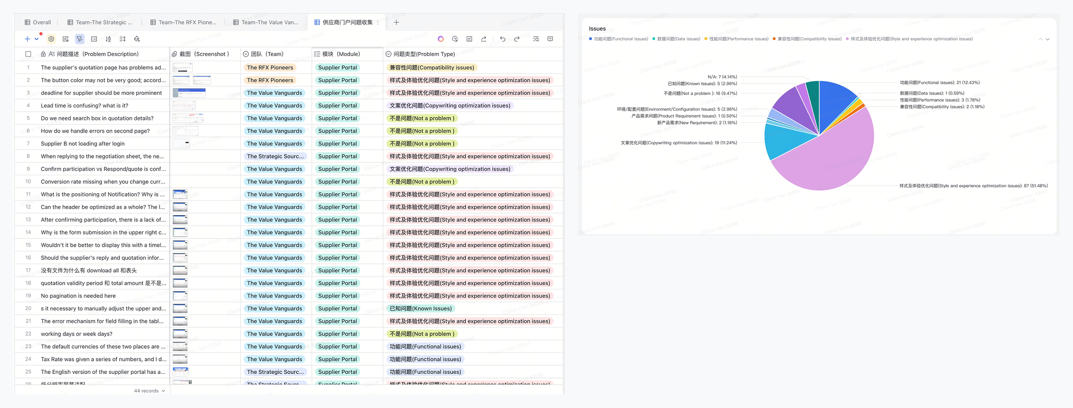
A workshop narrowed the issues down to four areas
The team split into groups playing buyers and suppliers, walked through the full sourcing flow, and logged every friction point. I tagged and clustered the issues, and they converged on four areas: Homepage, Detail Page, Quote Form, Negotiation Form.
My hypothesis was that a homepage Task Center was the only entry point that could cover the full flow
End-of-flow issues had limited reach. The homepage was the supplier's first landing point. A Task Center there could surface every stage, so suppliers would know exactly where they were the moment they logged in. Coupa and Oracle both take this approach.
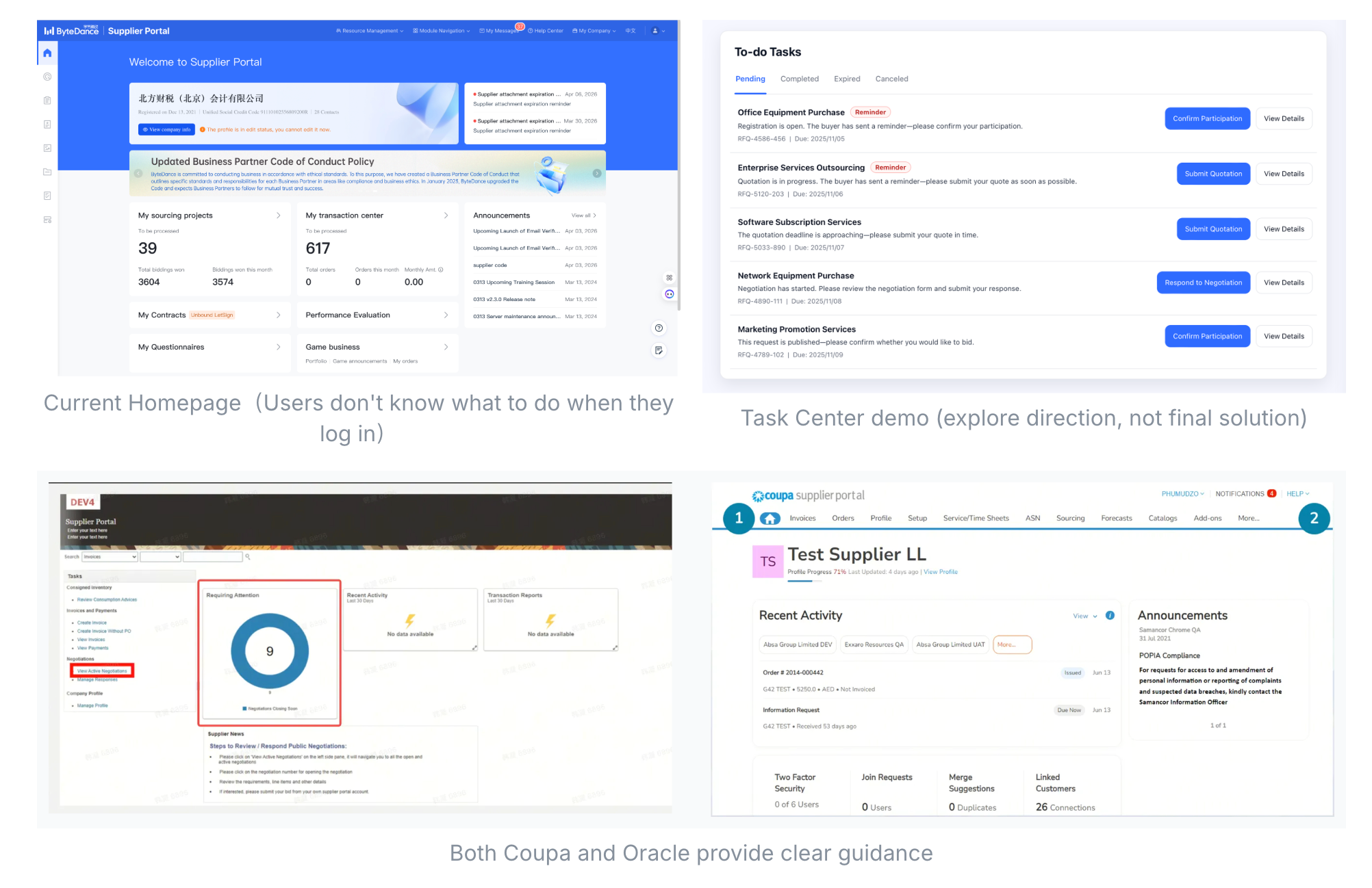
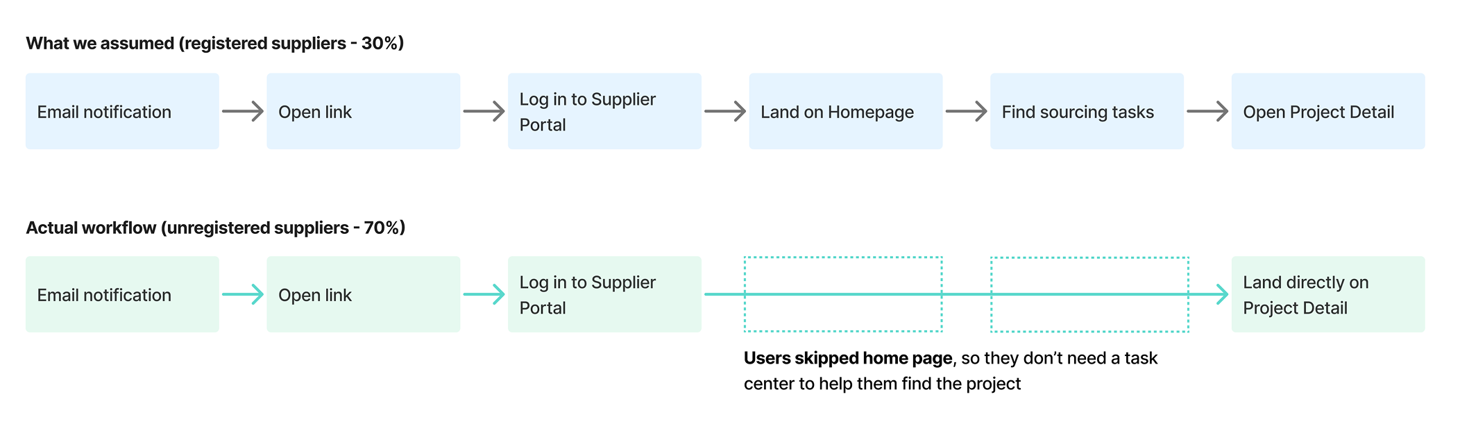
Validating with a demo revealed that most suppliers never reach the homepage
While walking suppliers through the demo, I found an unexpected fact: most suppliers log in via temporary accounts, which land directly on the sourcing detail page. The homepage is skipped entirely. The page we were optimizing was invisible to the majority of users.
The entry point had to be reframed.
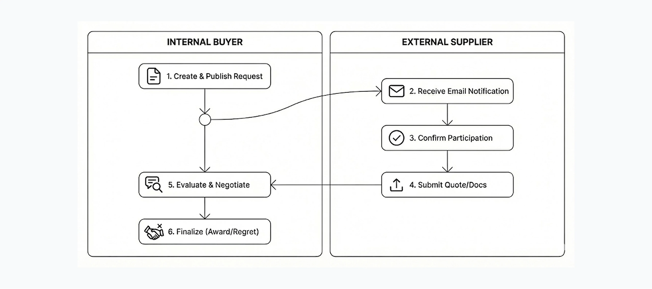
Refocused on four decision moments in the supplier journey
After re-mapping the supplier journey, I identified four moments that actually drive participation: email, detail page, participation CTA, and progress feedback. Together these moments shape whether a supplier decides to engage at all.
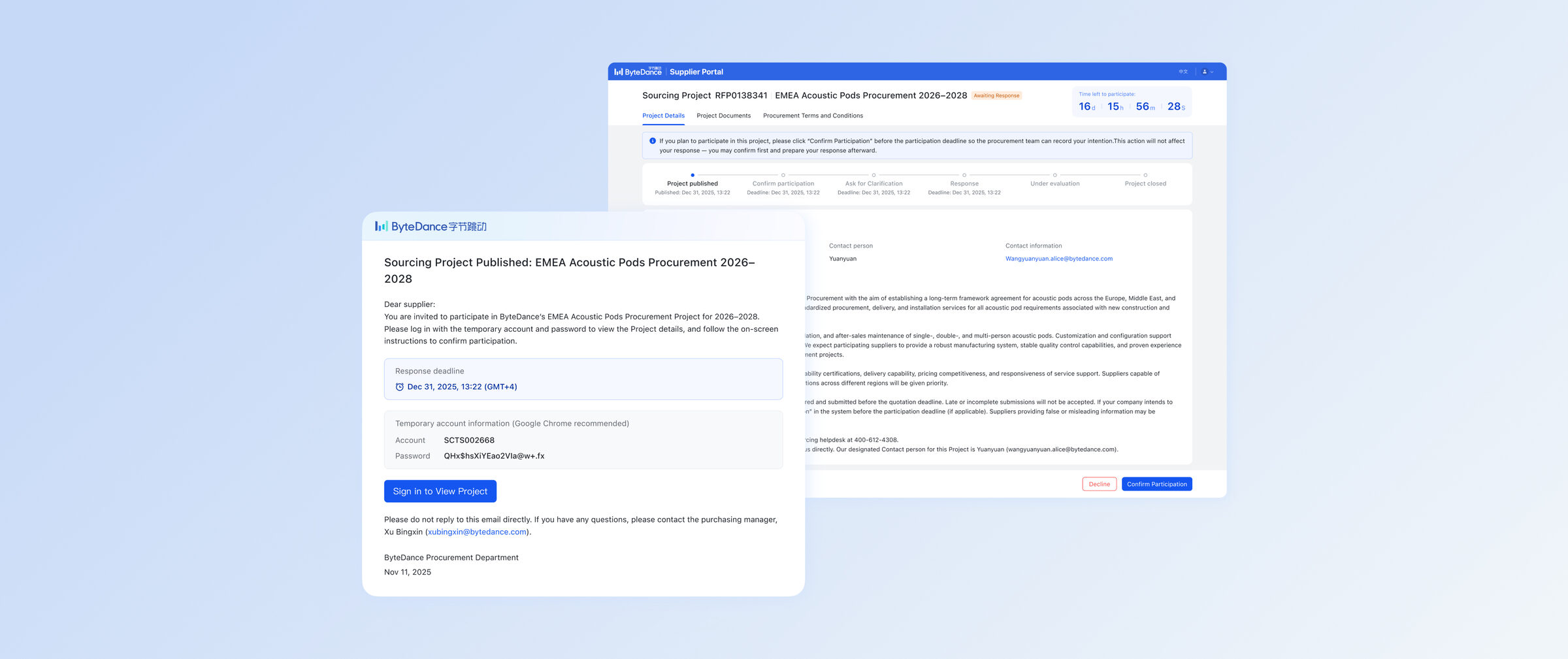
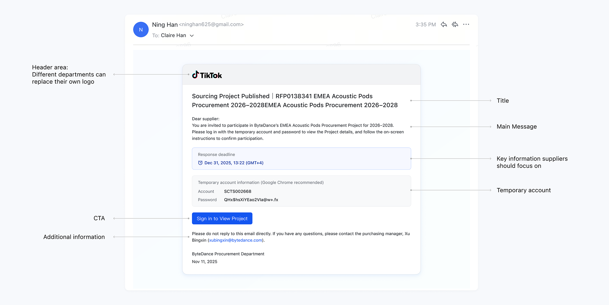
Moment 1: The supplier's first touchpoint is the email, not the homepage
The old invitation email was plain text, with key information buried in paragraphs and looking like spam.
I did three things to fix the email itself: rebuilt the information architecture to surface the essentials, refined the visual hierarchy so the primary action was obvious, and reviewed every subject line for clarity and scannability.
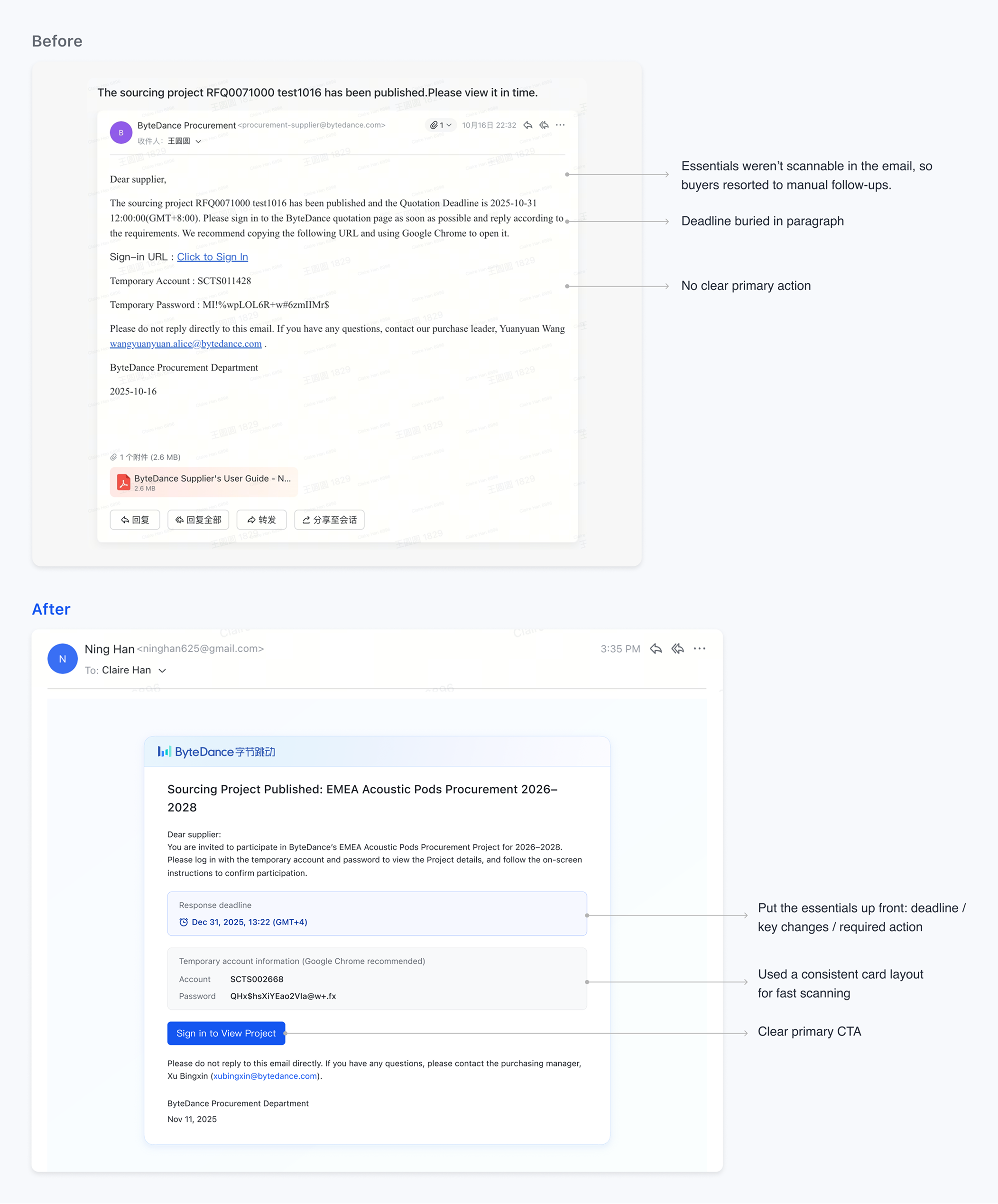
Then I turned the redesigned email into a reusable template covering different email types and procurement teams, so every future communication starts from the same foundation.
Moment 2: “Scroll-to-unlock” let legal compliance and information hierarchy coexist
The detail page had to show both sourcing info and legal terms, and legal required the full terms to be visible. I separated the two so sourcing info came first, and legal terms had to be scrolled to 100% before the checkbox could be ticked. The design satisfies compliance while keeping sourcing content from being buried.
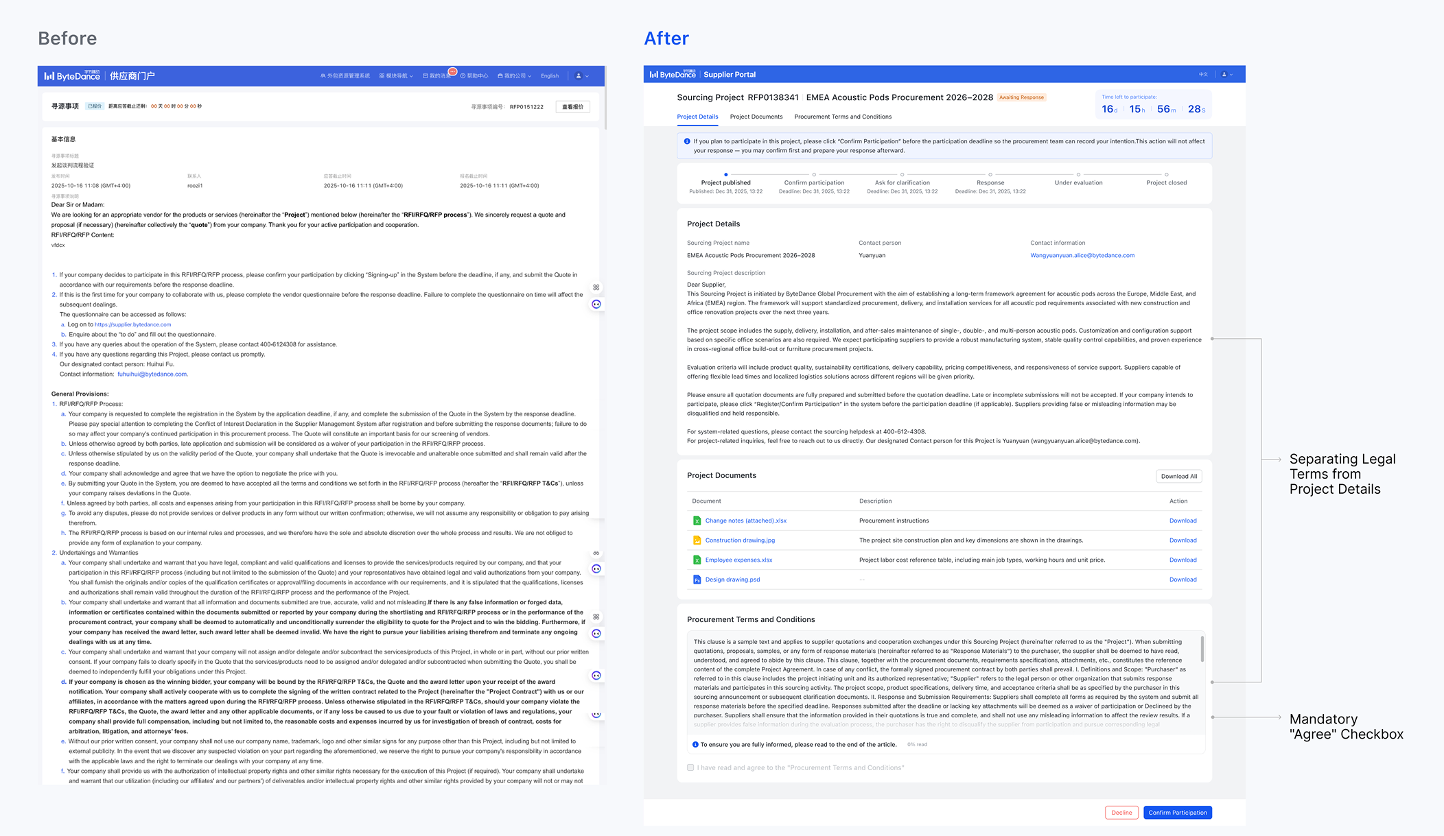
Moment 3: “Confirm participation” goes before “submit quote” to help buyers plan ahead
The old page exposed two CTAs side by side (Confirm Participation, Submit Quote). Suppliers didn't know which to click and often clicked neither. But there was a real business need behind this: buyers needed to know how many suppliers intended to participate early, so they could decide whether to expand the invite pool.
I hid the Quote button until after the participation deadline and added context telling suppliers that confirming intent does not lock in their quote, lowering the cost of action.
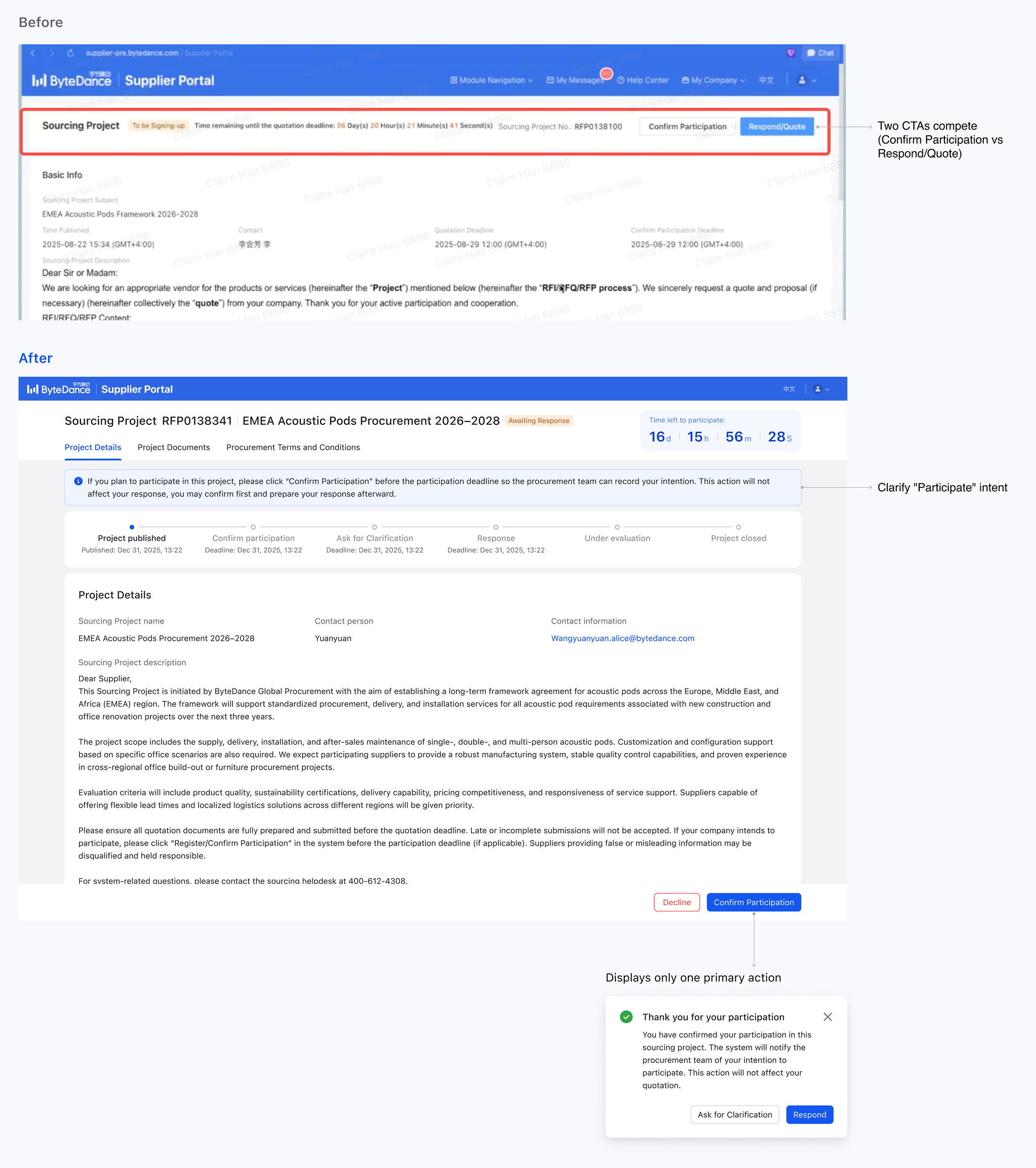
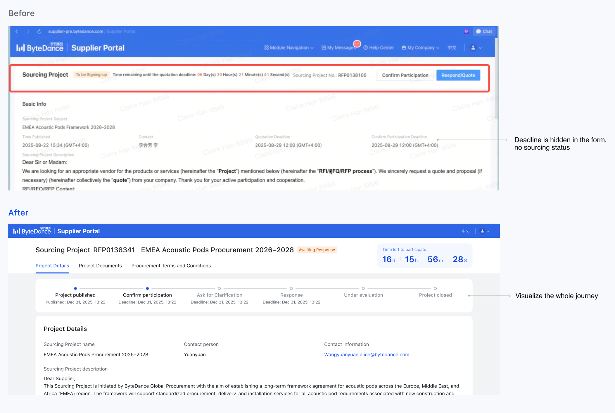
Moment 4: A new progress bar made the full sourcing flow visible to suppliers
Drawing a progress bar sounds simple, but the prep work was real. I mapped the full sourcing flow from scratch so the bar could accurately reflect where each supplier stood.
Adoption beat the target, and buyers went from reluctant to actively recommending the system
Piloted in Q4 2025 within a standalone business unit. The data and qualitative feedback both validated the new direction.
Two project calls I keep coming back to
Hypotheses need to be validated with real data, not just logic
The Task Center framing was logically sound and the ROI analysis held up, but the actual user path looked nothing like what I'd reasoned out. It's easy to substitute your own mental model for the user's. Validate with real data as early as possible.
Walking through a demo beats pure interviews
Users often can't articulate what they want, but once they see a real design in front of them, they'll immediately tell you what's wrong. It's a habit we got right on this project.